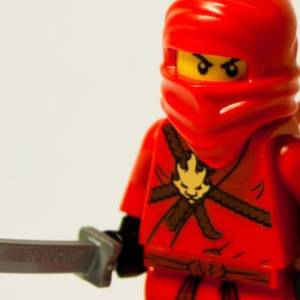
S Is For...
... Strenuous.
Always found S to be a letter that gives of difficulty to draw. Unlike many of the letters which are made up of the same basic parts. Once its done I have all the lowercase letters for the font that I'm designing. I am looking forward to the 'Kerning Pairs' which i'm going to do next as I quite enjoy that, but not so much looking forward to all the uppercase letters that will be needed. Then the punctuation. Oh and the special characters.
Quick phone blip as I'm off to Amicus Apple after work with the team for a bite to eat and a few drinks.
405
views
- 0
- 0
- Nokia N95
- 39
- f/2.8
- 6mm
- 100

Comments
Sign in or get an account to comment.


