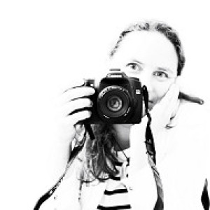
You look like you've...
... seen a ghost...
[finished version on my [url=http://www.blipfoto.com/entry/1501690]Kinda Horrigans[/url] journal]
Little bit of playing about with this, but hopefully pretty subtle. The main thing is that it's been converted to black and white in the finished version... and there's also a slight colour pop too. So, opened the RAW file and gave it a slight tweak for the clarity and exposure... then into Photoshop. I then converted it to black and white using a custom preset I made a while ago which gives a lighter centre and a smooth structure. Then, used a layer mask on this layer and a black brush set to 100% to take out the black and white where the eye is and pop the colour back out. It just seemed to lift it a little. I also used a hue/saturation layer and boosted the saturation by +20 to bring out the colour. On top of that was a 50% grey overlay blend layer to dodge and burn little bits such as the whiskers / tooth and parts around her eye / mouth.
Flattened the lot and then sharpened it and saved.
Tip of the Day:
Normally I loathe selective colour with a passion... but very very occasionally, it seems to work. Other things which drive me crackers include over-saturation, over-sharpening, camera shake, wonky horizons, blown highlights, images which are cropped within an inch of their life... however... if you want someone else's version of my processing rant, then 10 Deadly Post Processing Sins is good for a cringe (as you recognise that you've done most of them!)
- 1
- 0
- Canon EOS 50D
- 1/100
- 85mm
- 400

Comments
Sign in or get an account to comment.


