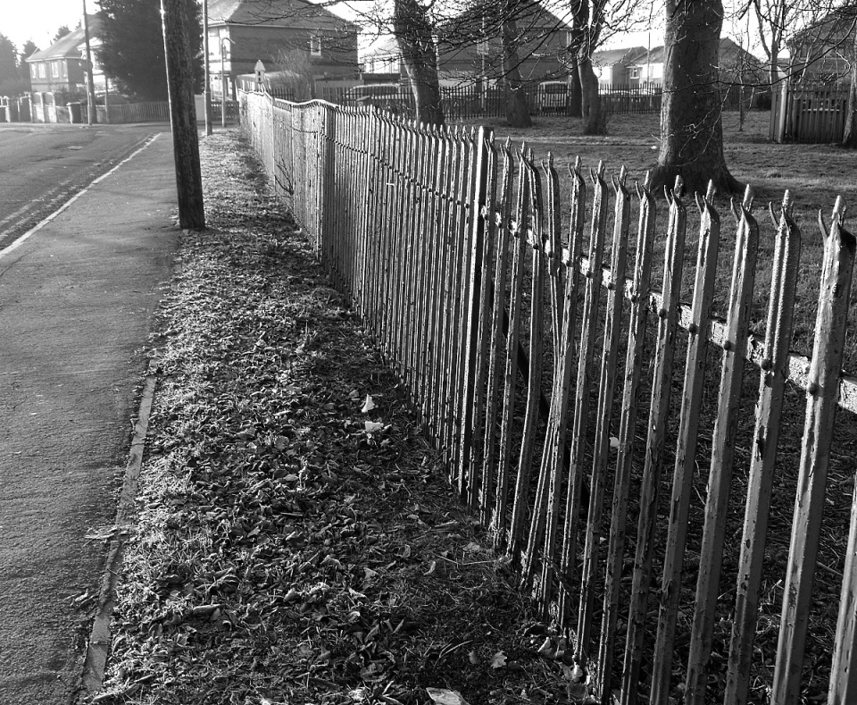
Close but no cigar
The idea was fine -- the strong light on the railings, their jaunty angles -- but the execution is flawed; there are blown highlights at the top of the picture which spoil it.
Learning point -- employ the highlight option in the custom menu, and observe!
142
views
- 0
- 0
- Panasonic DMC-G3
- 1/50
- f/6.3
- 19mm
- 200

Comments
Sign in or get an account to comment.


