Lost Details
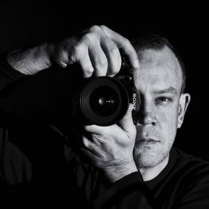
Having blurred out 3/4 of this frame to produce the popular tilt/shift effect, I have obviously lost a lot of detail. Luckily, if you have a 27" screen, you can see more detail than ever before with the new size Blip.....but not many folk do.
So, I'm a bit cross with myself. Blip central gave me a sneak peek at the new layout a month or so ago asking for feedback, but it was just 3 static pages and apart from being white there wasn't much feel. They sent no questions or a real idea of what they wanted and I ended up giving them no comment at all. Bugger. I disliked the white then but said nothing and the rest was hard to evaluate, with only promises that the stuff I liked would stay. It hasn't. The calendar has gone and that, more than anything, showed this was a daily photo journal. Now I feel like the point is totally gone, it is now a limited photo dumping site that visitors will not appreciate. The commenting is now disconnected to the photo you comment on, so it takes longer to catch up with them. Finally, from my list of top three "hates" of the new Blipfoto is; no stats! This is largely a confidence booster and an ego flatterer but it also has a value to potential sponsors/employers/customers.
I like the new bigger sized picture and hope it will bring the over all quality of submitted photos to a higher level. I also like the browsing functionality, it is better.
Overall. I think the poster on the right predicts the future for Blipfoto's users.
Comments
Sign in or get an account to comment.


