St Alban's Cathedral
I was invited today to judge an unusual photographic competition. Upminster Camera Club had arranged a morning photoshoot in St Albans. Those participating were given a couple of hours to wander round St Albans, taking photographs on 5 themes given to them at the start of the morning: "Cathedral", "Show me the light", "Trading", "Take a break" and "Circles". Their memory cards containing just one image from each theme, in JPEG form with no opportunity for post editing, were to be handed in before lunch, and I would then judge the images in the afternoon.
I decided that I would join them in the morning and take part in the challenge as well.
Apart from the problems of finding suitable subjects which were sufficiently unique to make them stand out from everyone else's images, a major issue was that the images would be presented as they were taken - straight out of camera with no editing. There was no opportunity even for slightly cropping images, never mind adjusting tones or even straightening an image when the camera hadn't been held absolutely level. This took me back to slide days, when you had to get the picture pretty well perfect in the camera - although even slides could be "cropped" - ie masked off to hide unwanted inclusions in the picture, or mounted at a slight angle in the frame to compensate for wonky horizons. So taking satisfactory images was quite difficult: selecting just one to represent each theme from all those taken was equally difficult.
I was quite relieved to see from their images that the club members had experienced similar difficulties to me, although some of the better images were really excellent, both their interpretation of the themes and their technical competence.
This picture taken inside the Cathedral and Abbey Church of St Alban (as it is correctly known) was taken by the usual method of lying the camera on the floor pointing upwards, a wide angle lens, and firing the shutter on a self timer before running out of the way. It does produce a somewhat vertiginous view. Despite several attempts I didn't achieve exact symmetry, and I would normally crop in Photoshop, but this is the image straight out of camera, as required by the competition. (My images, of course, were not entered in the competition, but they were shown to the club after I had completed my judging).
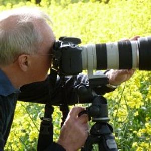
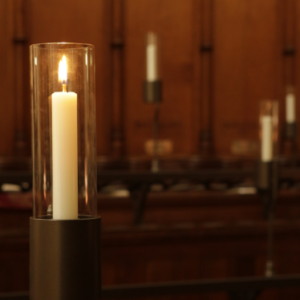
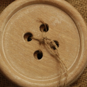
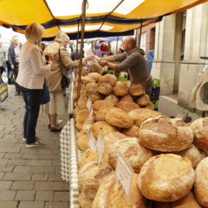
I don't normally add extras (they seem to me to be against the basic principle of Blipfoto), but on this occasion I have included the other four images I selected: far from perfect, but without any editing being allowed that is not very surprising.


Comments
Sign in or get an account to comment.


