
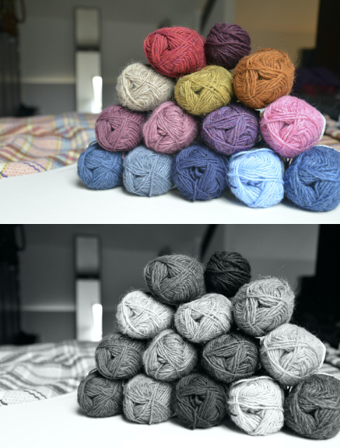
Colour value
Sometimes looking at the yarn and deciding that yarn x and yarn y will go together just doesn't work when you're doing colourwork. For example, looking at the blue and pink yarns (bottom rows, far left) they appear to be quite compatible, but when knitted up they'll probably look a bit blah - not enough contrast.
That's why I like to take a photo of my yarn and then convert it to black and white. The lack of contrast between the pink and blue is now much clearer.
Lets say I'm using 3 colours, I now know that if I choose the oatmeal (far left), baby blue (bottom row, right), and pink (far right) the lack of contrast between the colours means that the detail of the Fair Isle or Lopí pattern can be lost owning to the utter blandness of the combination.
A better combination, colour value-wise, would be the wine (top row), gold (row below), and lilac (row below) as there is a definite contrast between the three.
Then you have to consider the actual pattern - whether the pattern requires a highlight colour, and what colour will be used as the background/main colour. This is known (in my head) as colouring in time, and sort of justifies having lots of pens and pencils in pretty colours. On occasion my colouring in of different colour combinations has taken more time to complete than the thing I'm actually knitting.
But hey, colouring in!
Comments
Sign in or get an account to comment.


