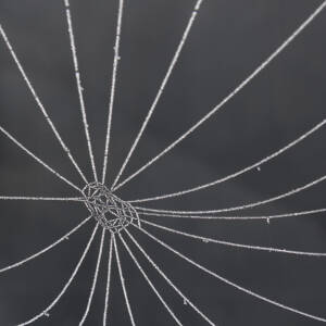
Solitude
My 'redundant' ex-colleagues and I met for lunch in London today so I headed off extra early to get to the Cartier-Bresson: A Question of Colour exhibition at Somerset House. It 'pays homage to a master who felt that black and white photography was the ideal medium, and could not be bettered, and to a group of photographers of the 20th and 21st centuries ... whose commitment to expression in colour was - or is - wholehearted and highly sophisticated, and which measured up to Cartier-Bresson's essential requirement that content and form were in perfect balance.'
I loved it.
A couple of days ago, while I was dissing my first raw photo, lookseeclick mused on what makes a good photo. I replied:
Over many years I've realised from my responses to art that my criterion for wanting to spend any time observing a 'piece of art' is that it must do at least two of three things well:
- be aesthetically pleasing (to me)
- be technically skilled (to the extent that I can tell)
- communicate a 'message' to me i.e. make me feel or think.
All three (rare) is a winner. Only one and I'm not interested.
A bit belatedly I've realised that this needs to be my criterion for my photos too.
I've never applied this consciously to an exhibition before but I did today. I went round twice, first registering the photographs I liked best, then seeing whether these 'rules' actually work. Three outcomes. The first didn't surprise me: all the pictures I'd picked out scored on all three of my criteria. The second was interesting: most were street photos of people. The third was a revelation: the 'message' of all those I liked best was of solitude, isolation or loneliness.
I think I've just set myself a challenge.
A rare comment: I think this picture is better large.
Black and white in colour 16

Comments
Sign in or get an account to comment.


