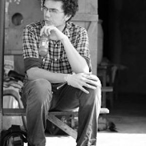
Harriet
I need to start talking about the photos again, rather than blogging about everyday life...
So here's a simple portrait I took of Harriet, while we were chilling in the engineering lounge. The only thing I was consciously thinking about when taking the photo was combining the lighting with a natural moment. I decided not to abide by rules of composition (rule of thirds, leaving space for the subject to look into, etc.) and is uncropped. The photo was taken spontaneously. That's when I wonder to what extent and in what way your photographic eye trains itself after years of photographing.
Sometimes I'll reframe a photo by cropping to compensate for a lack of focal length (ie. zooming). But when I crop slightly, just to recompose a photo, I won't tend to be satisfied. I'm assuming that's got to do with my instinctive way of organizing all the elements within the photo in the most appealing way (lighting, subjects, colors, mood, background). Everyone will have a different eye and will compose differently, when photographing spontaneously.
Thinking about this, and after trying unsuccessfully to crop this photo, Ali and me came to a couple of conclusions as to why I framed it as such:
1) Cropping the left off removes the blue-shirted guy who's half in the frame. This removes the balance between him and the blue boards, making them overwhelming. This draws attention to the boards as well as the guy sitting next to them, who clutters the background around the subject, therefore drawing attention away from the subject.
2) Cropping the white wall of the right side of the frame leaves Harriet too much on the right hand side of the photo. This doesn't give her any frame space to look into, which doesn't look good.
3) Avoiding both these problems by cropping so that the subject fills up most of the frame vertically seems like a good solution (and can both the composition rules I decided to omit). However, this removes from the high-key feel of the photo, making it less interesting.
(Note: when I refer to cropping, its keeping the same aspect ratio as the original, none of this weird ratios stuff...)
So there you go, over-analyzing a simple photo (sorry Harriet). Just like in the old days! I wouldn't mind writing an essay about a single photo (albeit one that's more worth it). Any comments on my analysis are welcome.
King Baba's social tonight! Gonna be awesoooooooooooome

Comments
Sign in or get an account to comment.


