
UX / UI
User experience, user interface. These are my current hobby-horses, and have been for quite some time.
Things that are poorly or wrongly explained, things that are ambiguous or misleading, unintuitive processes, a lack of thought; it just drives me nuts.
Recently, I applied, on behalf of myself and two of my daughters, to run in the next Manchester half-marathon. The section I filled in was for 'Ages 17 and over', for which I selected three entrants. Having entered my own details, I was prompted to enter details for runners under 17. Upon contacting the help desk, I was told that the section I'd filled in could only be completed for one runner over 17, and they were genuinely confused when I asked why, in that case, I was able to select three runners. I didn't even get on to the text.
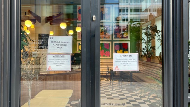
And here was today's irritation: "Door out of order Please use left door". A notice pinned on the left door.
I started to go on about it, but some affectionate* eye-rolling from the Minx told me to keep it to myself.
(We had been to see 'Top Gun: Maverick' which could not have exceeded my expectations more.)
*My interpretation.
Comments
Sign in or get an account to comment.


