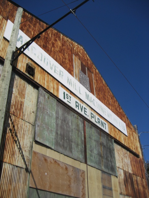
i work at a mill machinery plant.
place: Vancouver Mill Machinery 1968 Ltd, 1st Ave Plant (CAN)
mood: patchy
Mill? Machinery? Plant?
Someone was obviously quite undecided on the function this building actually served. Either way, this dilapitated structure now serves as a beautiful example of complementary colours working in unison.
The rustic reds of the eroding corrugated aluminum siding goes nicely with the fading green of the painted wooden boards and the lettering of the two signs. And thanks to the warm-hued gradient the rusting process leaves behind, there are streaks of light orange beneath the long banners, and bold blotches of warm reddish-orange above, both of which complements the blue of the sky. And this may be a stretch, but I do believe the yellow of the lime green metal panels are also in complement with the tinge of purple detectable in the sky, because it's not a true Middle Blue, but more of a tertiary blue-dark violet.
And so, this picture captures more than just the middle hues - the unpredictable errosion pattern on the metal panels and the black smears on the wooden boards produces darker warm reds, lighter cool oranges, and darker and lighter green variants that broaden the visual interest and range of complements and contrasts in terms of colours and materlals.
In addition, I think the rectangular shapes of the metal and wood create the interesting visual effect of blocking, and it is emphasized by the size of the panels, which changes due to the angle at which this photograph was taken.
The white of the two signs provide a nice graphic punch in the mish-mash of complementary colours patched and paired together.
221
views
- 0
- 0
- Canon PowerShot SD600
- f/5.6
- 6mm
Comments
Sign in or get an account to comment.


